Year 1: FMP
This is a passport-styled identity book that was based on the theme of 'personal data' and identity. It follows me as a person and how I express myself through art.
Name MD comes from my names, Manuel Danciu/Darius


Front Cover

For the front cover, I needed to make something personal to me, that you could tell was about me just from looking at it, so I took elements that I designed in class earlier that year such as the 'a creative thought' or the logo. I played with layout and moved things around a lot as this was my first big project working with layout and contrast so I tried to see what sticks. I used some textures I scanned from photocopying a collage I did earlier, I chose to use these textures everywhere in the book for extra detail and colour.


ID Card

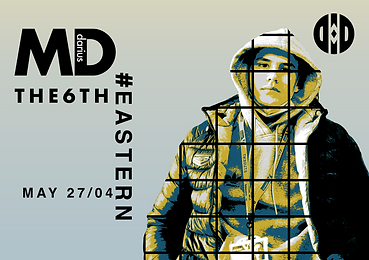

This ID page was the main focus of the whole passport, I tried to implement everything I learned at the time into one piece. I used elements from Paula Scher and Gilbert and George. I took the text grid from Paula Scher and replaced the words with things that either described me or meant something to me from area postal numbers to the nickname of my town. The image of myself was filtered to make layers of colours and then I added the grid pattern that Gilbert and George use in their work.


UK Stamp Page

For the stamp pages, I wanted to have a landmark that portrays the country so for each country, I gave them a famous building either a historical landmark or more modern. For the UK I chose the Shard as it's a famous building that describes the UK as a technological center point for the world, I chose to theme the page with a more modern design using san serifs and bold text. The stamps were made using the countries' colours and the date that I arrive there for the first time.


ROM Stamp Page

For Romania, I chose Peleș Castle, as it's a landmark of old Romanian architecture and had a tall tower making it fit in better in the frame. For the stamps, I chose the tricolours of Romania and I put the date I first went back after moving to the UK. I used for serif fonts to match the old theme that I went with this page.


Italian Stamp Page

I chose the Tower of Pisa for Italy as it's a cultural landmark for the Italian people and as its tall and slants into the page it fits in better with the vertical aspect of the page. For the stamp, I kept the same design just changed the colours to match the Italian tricolours, and used more of a simpler serif font, as they fit better with the Italian theme. The title on the left 'ITALY' is made in a way to resemble the pillars and arches of the Tower of Pisa with the line above and below them and the text being the pillars.

